Last updated April 2026 — refreshed for current tool versions, Core Web Vitals guidance, and WCAG 2.2 requirements.
Choosing between a slider and a carousel is one of the most common decisions in web UI design — and one of the most frequently misunderstood. Both elements present content in a contained, scrollable view, but they differ fundamentally in layout, interaction model, and performance profile. Get the choice wrong and you create banners nobody reads, pages that fail Core Web Vitals, or components that fail accessibility audits.
This guide cuts through the confusion: clear definitions, hard UX data, a current library comparison (versions current as of April 2026), accessibility requirements mapped to WCAG 2.2, and a decision framework so you can self-route without guessing.
What changed for 2026 — key updates from the last yearWCAG 2.2 is now ISO/IEC 40500:2025. Finalized as an international standard in October 2025. The US DOJ's April 2026 deadline requires WCAG 2.1 Level AA for public-sector sites, but WCAG 2.2 is the practical benchmark for new builds.CSS-native carousels are emerging. Chrome 135+ introduced experimental pseudo-elements (::scroll-button()and::scroll-marker-group) that generate carousel controls with pure CSS — no JavaScript. MDN documents the pattern; wider browser support is expected by late 2026.INP replaced FID in Core Web Vitals. As of March 2024, Interaction to Next Paint (INP) is the responsiveness metric. Carousels built on heavy third-party libraries that block the main thread now fail INP thresholds. The good threshold is ≤200 ms.Swiper.js hit v12 (v12.1.3 released March 2026), adding Web Components support and tree-shakeable modules. Embla Carousel released v8 with ResizeObserver-based auto-detection and a v9 migration guide underway.Engagement data confirmed: web carousels still underperform. Baymard Institute's latest benchmark of 327 top e-commerce sites shows 52% use a homepage carousel on desktop, yet fewer than 1% of visitors click on features beyond the first slide. Static alternatives match carousel performance in user testing while being simpler to optimize.
TL;DR: Slider vs. Carousel at a Glance
| Dimension | Slider | Carousel |
|---|---|---|
| Visible items at once | One | Two or more (partial or full) |
| Primary use | Hero, focused storytelling, onboarding steps | Product galleries, portfolios, testimonial rows |
| Navigation model | Sequential (prev/next, dots) | Browse (swipe, drag, scroll, arrows) |
| LCP risk | High if hero image is in slide 2+ | High if first row images are JS-loaded |
| CLS risk | Medium (fixed-height containers help) | Medium-High (autoplay accumulates shifts) |
| Accessibility complexity | Medium (WCAG 2.2.2 for autoplay) | High (role=region, live regions, tab order) |
| Best library (2026) | Swiper v12, Embla Carousel v8 | Swiper v12, Embla Carousel v8, Keen Slider |
| Pure-CSS option | CSS Scroll Snap (all modern browsers) | CSS Scroll Snap + Chrome 135 pseudo-elements |
Definitions: What Each One Actually Is
What Is a Slider?
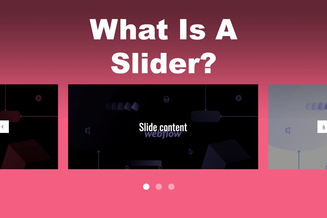
A slider (also called a slideshow) presents one item at a time. The viewport is always full-width (or a fixed region), and only one slide is visible at any moment. Navigation moves between discrete slides — previous/next arrows, dot indicators, or a swipe gesture. Autoplay is common but optional.
Typical slider use cases:
- Full-width hero banners on landing pages
- Sequential onboarding steps
- Testimonial rotators (single quote at a time)
- Before/after image comparisons
- Product feature walkthroughs
What Is a Carousel?
A carousel displays two or more items simultaneously in a horizontal row (or occasionally vertical column). Users scroll, drag, or swipe to bring new items into view while others remain partially visible as affordance cues. The word "carousel" comes from the circular arrangement metaphor — items loop around.
Typical carousel use cases:
- E-commerce product shelves ("Customers also bought")
- Image and video galleries
- Portfolio thumbnails
- Multi-card testimonials
- Content feeds (articles, podcasts, events)
The key distinction: a slider is about focus — one message, one image, full attention. A carousel is about browsing — scanning options, comparing, choosing.
Performance Impact: Core Web Vitals Reality
Both patterns carry real performance risk. Google's Core Web Vitals (LCP, CLS, INP) are ranking signals, and carousels and sliders touch all three.
LCP — Largest Contentful Paint (target: ≤2.5 s)
The first visible hero image is almost always the LCP element on pages that use sliders. According to web.dev's carousel performance patterns, loading carousel content via JavaScript is the single biggest performance mistake — the browser cannot discover those images during preload scanning, so they load late. The fix is to render the first slide's <img> in static HTML and add fetchpriority="high":
<!-- Correct: first slide in HTML, high priority -->
<img src="/hero-slide-1.webp"
     alt="..."
     fetchpriority="high"
     loading="eager"
     width="1440" height="600">

<!-- All other slides: lazy -->
<img src="/hero-slide-2.webp"
     alt="..."
     loading="lazy"
     width="1440" height="600">
According to the 2025 Web Almanac, only 62% of mobile pages achieve a good LCP — the hardest Core Web Vital to pass. A poorly implemented hero slider is a common cause.
CLS — Cumulative Layout Shift (target: ≤0.1)
Autoplay carousels are a CLS trap. If slide transitions use layout-inducing CSS properties (left, top, margin) instead of transform, every transition accumulates shift. On a page with infinite autoplay, CLS can grow without bound. Use CSS transform: translateX() exclusively for slide movement, and give the container an explicit aspect-ratio or fixed height so the browser reserves space before images load.
INP — Interaction to Next Paint (target: ≤200 ms)
Carousels with minimal JavaScript — or CSS-native scroll-snap implementations — are fine for INP. The risk is third-party slider libraries that bundle large scripts, run synchronous layout recalculations on scroll, or register hundreds of event listeners. If a carousel library causes long tasks (>50 ms on main thread), replace it with a lighter alternative or the native CSS approach.
Library Landscape in 2026
The ecosystem has consolidated around a handful of actively maintained packages. Here are the current leaders as of April 2026:
| Library | Latest version | Weekly npm downloads | Framework | Key strength |
|---|---|---|---|---|
| Swiper | v12.1.3 (Mar 2026) | 4M+ | JS, React, Vue, Svelte, Web Components | Most feature-complete; touch, virtual slides, 3D effects |
| Embla Carousel | v8.6.x (late 2024) | 800K | Vanilla JS, React, Vue, Svelte | Headless, hooks-based, lightweight; v9 in development |
| Keen Slider | v6.x | ~200K | Vanilla JS, React, Vue, Angular, Svelte | Small bundle, parallax, drag, native-feel touch |
| React Slick | v0.30.x | 1.2M | React | Mature API, large ecosystem of examples |
| CSS Scroll Snap (native) | N/A — browser built-in | N/A | Any | Zero JS, no dependency, excellent browser support |
Recommendation by use case:
- Performance-critical hero slider → CSS Scroll Snap or Embla Carousel v8 (headless, no bundled CSS).
- Feature-rich product carousel with virtual slides → Swiper v12 (tree-shakeable; only import what you use).
- Server-side-rendered app (Next.js, Nuxt) → Embla Carousel (SSR-safe) or react-multi-carousel (explicit SSR support).
- Rapid prototype / WordPress / no-build → Swiper CDN build or CSS Scroll Snap.
What to avoid: OwlCarousel2 — last release was 2019, has open XSS issues (CVE-2020-28482). slick-carousel — unmaintained since 2016; React Slick wraps it and is still maintained, but the underlying dependency is stale. Flickity — still functional but minimally updated; evaluate against Embla as a modern alternative.
The CSS-Native Carousel: 2026 Development
Chrome 135 shipped experimental pseudo-elements that let you build carousels with zero JavaScript:
/* Chrome 135+ experimental — enable via chrome://flags */
.carousel {
  overflow-x: auto;
  scroll-snap-type: x mandatory;
}

.carousel::scroll-button(inline-start) { content: "←"; }
.carousel::scroll-button(inline-end)   { content: "→"; }

.carousel::scroll-marker-group {
  display: flex;
  gap: 8px;
}

.carousel-item::scroll-marker {
  content: "";
  width: 8px; height: 8px;
  border-radius: 50%;
  background: #ccc;
}

.carousel-item::scroll-marker:target-current {
  background: #333;
}
This is experimental and Chrome-only as of April 2026. For production, combine CSS Scroll Snap (universal) with progressive enhancement using the new pseudo-elements where supported. MDN Web Docs covers the full API.
Accessibility: WCAG 2.2 Requirements
WCAG 2.2 became ISO/IEC 40500:2025 in October 2025. The following success criteria apply directly to sliders and carousels:
| WCAG SC | Level | What it means for carousels |
|---|---|---|
| 1.3.1 Info & Relationships | A | Structure must be programmatically determinable. Use <ul>/<li> for slides, role="region" on the container with aria-label. |
| 2.1.1 Keyboard | A | All navigation must work via keyboard alone. Arrow keys and Tab must move through slides and controls. |
| 2.2.2 Pause, Stop, Hide | A | Auto-advancing content lasting more than 5 seconds must have a pause/stop mechanism. Autoplay carousels with no pause button fail this criterion. |
| 2.4.7 Focus Visible | AA | Keyboard focus indicators must be visible on prev/next buttons and dots. |
| 2.4.11 Focus Appearance (new in 2.2) | AA | Focus indicators must meet minimum size and contrast requirements (area ≥ perimeter × 2 CSS px, contrast ≥ 3:1). |
| 4.1.2 Name, Role, Value | A | Controls need accessible names: aria-label="Next slide", aria-label="Go to slide 3" on dots. |
Minimal Accessible Carousel Markup
<section aria-label="Featured products" aria-roledescription="carousel">
  <button aria-label="Pause slideshow" id="pause-btn">⏸</button>

  <div aria-live="polite" aria-atomic="false">
    <ul>
      <li role="group" aria-roledescription="slide" aria-label="1 of 3">
        <!-- slide content -->
      </li>
      <li role="group" aria-roledescription="slide" aria-label="2 of 3" aria-hidden="true">
        <!-- slide content -->
      </li>
    </ul>
  </div>

  <button aria-label="Previous slide">←</button>
  <button aria-label="Next slide">→</button>
</section>
Non-visible slides must have aria-hidden="true" and display: none or visibility: hidden to remove them from the accessibility tree. The W3C WAI Carousels Tutorial provides the full reference implementation.
UX Data: What the Research Actually Shows
The empirical evidence on homepage carousels has been consistent for years, and nothing in 2025–2026 changed the fundamental finding:
- Fewer than 1% of visitors click on carousel features beyond the first slide, according to Notre Dame University's widely-cited study (still the most comprehensive longitudinal data on this).
- 40% of clicks go to the first slide; 18% to the second; 11% to the last. By slide 3, most visitors have already scrolled past.
- 52% of top US e-commerce sites still use a homepage carousel on desktop (Baymard Institute benchmark of 327 sites). 46% of those carousels have measurable performance issues.
- Baymard's lab testing found that a static promotional section performs as well as a carousel in user testing, while being significantly easier to optimize for Core Web Vitals.
- Social media carousels are different. LinkedIn carousel posts achieve 24.42% average engagement rate versus 6.67% for standard text posts. Instagram carousel posts outperform single images (1.92% vs 1.74% engagement rate). This is a fundamentally different interaction context — don't apply social carousel metrics to website carousel decisions.
The takeaway: if you're using a homepage hero slider primarily because "we need to feature multiple messages," the data suggests restructuring that content as a scrollable page section will perform as well or better and be simpler to build correctly.
SEO Implications
Both patterns create SEO risks if implemented carelessly:
- Hidden content indexing: Googlebot renders JavaScript, but slides beyond slide 1 that are hidden via CSS (
display: noneorvisibility: hidden) may be deprioritized or not indexed. If a slide contains important text, render it in the DOM and expose it witharia-hiddenonly for screen readers — notdisplay: none. - LCP and ranking: Google's Page Experience update uses Core Web Vitals as ranking signals. A hero slider that scores poorly on LCP (<2.5 s) contributes to weaker rankings, particularly on mobile.
- Image SEO: All slide images need descriptive
alttext. Blankalt=""attributes on non-decorative images waste indexable content. - Lazy loading trap: Over-applying
loading="lazy"to the LCP image delays it unnecessarily. The first visible slide image should always beloading="eager"withfetchpriority="high".
Decision Tree: Which One Should You Use?
Work through these questions in order:
- Is there a single, most important piece of content to show? → Use a slider (or consider a static hero — no component at all).
- Do users need to compare or browse multiple items? → Use a carousel.
- Is the component above the fold on mobile? → Whatever you choose, avoid JS-loaded images in the first visible slot. Prioritize LCP.
- Do you need autoplay? → Think hard about whether it actually helps. If yes, implement a visible pause button (WCAG 2.2.2). If you can't justify the pause button, drop autoplay.
- Is your team's capacity limited? → Simpler always wins. A static hero section with a clear CTA outperforms a badly-implemented carousel in both UX and Core Web Vitals.
- Is the app server-side rendered? → Use Embla Carousel or react-multi-carousel; avoid Swiper's default SSR configuration (check docs for the
noSwipingand hydration notes).
Implementation Best Practices
Slider Best Practices
- Cap at 3–5 slides. Engagement drops sharply after slide 3.
- Make slide 1 self-sufficient — don't depend on users seeing slide 2.
- Give each slide an explicit, equal height so the container doesn't shift on load.
- If autoplay is needed, set interval to at least 5 seconds and include a visible pause control.
- Use
fetchpriority="high"on the first slide image;loading="lazy"on all others. - Test with keyboard-only navigation before shipping.
Carousel Best Practices
- Show partial edges of the next item as a scroll affordance — users often don't realize a carousel is scrollable otherwise.
- Use CSS
scroll-snap-type: x mandatoryfor smooth, physics-correct snapping without JavaScript overhead. - Make touch targets (arrows, dots) at least 44×44 px on mobile (WCAG 2.5.5 Target Size, Level AAA; aim for it anyway).
- Non-visible slides must be
aria-hidden="true". - Avoid injecting navigation controls via JavaScript on hover — it causes CLS.
- Lazy-load all carousel images except those visible in the initial viewport.
- Track engagement: if analytics show zero interaction with slides 2+, replace the carousel with a static grid.
Types and When to Use Each
Slider Variants
- Hero slider — Full-width above-the-fold. Use sparingly; a strong static hero often converts better.
- Testimonial slider — Single quote rotator. Works well; keeps focus on one voice at a time.
- Before/after slider — Interactive drag to reveal (e.g., image retouching demos). High engagement when the comparison is meaningful.
- Onboarding stepper — Step 1 of 4, Step 2 of 4. Often better implemented as a
<dialog>with progress indicator rather than a slider.
Carousel Variants
- Product shelf carousel — "Customers also viewed." Standard on e-commerce; Swiper or Embla are the natural choices.
- Full-viewport carousel — Full-screen storytelling, each panel takes the whole viewport. Rare and heavy; ensure CLS and LCP are clean.
- Thumbnail filmstrip — Small images below a main image viewer. Common in product pages; CSS Scroll Snap handles this without a library.
- Content card carousel — Articles, podcasts, events. Works well on mobile when a grid would require too much vertical scroll.
Common Pitfalls and How to Fix Them
| Pitfall | Consequence | Fix |
|---|---|---|
| JS-loaded hero images | Poor LCP, Google ranking impact | Put first slide <img> in static HTML with fetchpriority="high" |
| Autoplay with no pause button | WCAG 2.2.2 violation; ADA lawsuit exposure | Add visible pause/play control; or disable autoplay |
Non-composited transitions (left, margin) |
CLS accumulation on autoplay | Use transform: translateX() only |
| No explicit container height | CLS on image load | Set aspect-ratio or explicit height on the slide container |
Hidden slides with display: none |
Content not indexed by Google | Use aria-hidden="true" + visibility: hidden or positional offscreen technique |
| Missing alt text on slides | Accessibility failure + lost image SEO | Descriptive alt on every image; alt="" only if purely decorative |
| OwlCarousel2 / slick-carousel | Unmaintained; security issues | Migrate to Swiper v12 or Embla Carousel v8 |
| Too many slides | Engagement cliff after slide 3 | Limit to 3–5 slides; put your best content first |
Real-World Implementation Examples
Sliders in the Wild
- Apple Mac lineup page — Uses a manually-navigated hero for feature comparison. No autoplay; users control the pace.
- Personal portfolios — Single-focus project showcase. One project, full attention, strong CTA.
- Testimonials — Airbnb-style single-review rotator with manual navigation and a subtle progress indicator.
Carousels in the Wild
- Amazon product recommendations — Horizontal scroll carousel with partial next-item visible as affordance. CSS Scroll Snap on mobile.
- Netflix row layout — The canonical multi-item carousel: hover to expand, keyboard accessible, chunked lazy loading.
- SaaS pricing pages — Multi-testimonial carousel for social proof, with rating stars and company logos for scannability.
If your team is building production-quality carousels or sliders and needs experienced frontend developers who have shipped these patterns at scale, Codersera's vetted remote developers can extend your engineering team with engineers who know these tradeoffs first-hand.
When to Use Neither
Before committing to a slider or carousel, consider whether you actually need one:
- Static hero section with single strong CTA — Outperforms a slider on conversion rate in most A/B tests (fewer distractions, no CLS risk, trivial to optimize LCP).
- CSS Grid product gallery — All products visible on load, no interaction required. Better for SEO (all content indexed), better for LCP (no JS gating), better for accessibility.
- Vertical scroll list — Users scroll vertically naturally. Horizontal scrolling carousels on desktop can be invisible to users who don't notice the affordance.
- Tabs or accordion — For content that needs switching but doesn't benefit from the spatial metaphor of a carousel.
The UX data is clear: most homepage sliders are a solution looking for a problem. If your reason for adding one is "we have multiple things to feature," a scrollable page section is usually the right answer.
FAQ
What is the exact difference between a slider and a carousel?
A slider shows one item at a time in the full viewport width and advances sequentially. A carousel shows two or more items simultaneously in a scrollable row, letting users browse rather than step through content one by one.
Do carousels hurt SEO?
Not inherently, but common implementation errors do. JavaScript-loaded carousel images delay LCP (a ranking signal). Slides hidden with display: none may be deprioritized by Googlebot. Non-composited transitions cause CLS. All of these are fixable — carousels themselves are not penalized if they're implemented correctly.
Should I use autoplay on a carousel?
Avoid it unless there's a strong UX reason. Autoplay violates WCAG 2.2.2 unless you provide a pause control. It reduces click rates on secondary slides (users dismiss auto-advancing content). If you must use autoplay, set it to at least 5 seconds per slide, provide a visible pause button, and stop rotation on hover and focus.
What is the best carousel library in 2026?
For most projects: Swiper v12 (most features, 4M+ weekly downloads, Web Components support) or Embla Carousel v8 (headless, lightweight, hooks-based for React/Vue). For zero-JS setups, CSS Scroll Snap with scroll-snap-type: x mandatory works in all modern browsers without any library.
How do I make a carousel work well on mobile?
Use CSS scroll-snap-type: x mandatory on the container and scroll-snap-align: start on each item. Show a partial next item (10–15% of the next card) as a scroll affordance. Make touch targets at least 44×44 px. Test on a real device at 360px viewport width — simulator testing misses many touch issues.
How do I make a carousel accessible?
The minimum requirements: role="region" and aria-label on the container; aria-roledescription="carousel"; role="group" and aria-label="Slide N of M" on each slide; aria-hidden="true" on non-visible slides; accessible names on all controls; keyboard navigation via arrow keys; and a pause button if autoplay is used (WCAG 2.2.2). The W3C WAI Carousels Tutorial has a reference implementation.
Is a static hero better than a slider?
For most sites, yes. Baymard Institute's research shows that a static promotional section performs as well as a homepage carousel in user testing, while being simpler to optimize for Core Web Vitals. Unless you have A/B test data showing a slider outperforms a static layout for your specific audience, the static hero is the safer default.
What is CSS Scroll Snap and should I use it?
CSS Scroll Snap is a native browser feature that snaps scrollable containers to defined positions — exactly what carousels need. It works in all modern browsers (Chrome, Firefox, Safari, Edge). Combined with overflow: auto, scroll-snap-type: x mandatory, and scroll-snap-align: start on items, you get a functional, smooth carousel with zero JavaScript and zero npm dependencies. For many use cases this is the best starting point, and you add a library only if you need features like virtual slides, 3D effects, or complex autoplay logic.
References and Further Reading
- Carousels — Web Vitals Patterns (web.dev / Google)
- Carousels Tutorial — W3C Web Accessibility Initiative (WAI)
- 10 UX Requirements for Homepage Carousels — Baymard Institute
- Usability Guidelines For Better Carousels UX — Smashing Magazine
- Swiper Changelog — swiperjs.com
- Embla Carousel Releases — GitHub
- Creating CSS Carousels — MDN Web Docs
- WCAG 2.2 Is Now an ISO Standard — ADA Quick Scan