
Last updated April 2026 — refreshed with current accessibility standards, eye-tracking research, and practical examples.
The seven principles of design are the foundational rules that govern every effective visual composition — from a mobile app button to a billboard. Knowing them lets you diagnose why a layout feels "off" and fix it with precision rather than guesswork. This guide covers each principle with concrete real-world examples, actionable application tips, and how they interact with modern accessibility requirements.
What changed since this post was first written (2023 → 2026)
- WCAG 2.2 is now the legal baseline. Published October 2023, it adds 9 new success criteria on top of WCAG 2.1 — including minimum touch-target size (24×24 CSS pixels at Level AA), focus-not-obscured rules, and CAPTCHA-free authentication. Contrast requirements (4.5:1 for normal text, 3:1 for large text and UI components) remain unchanged from WCAG 2.1 AA.
- AI-assisted design tools are mainstream. Figma's AI features (auto-layout suggestions, design linting), Adobe Firefly inside Illustrator and Photoshop, and tools like Canva's Magic Design now apply these principles automatically — which makes understanding the underlying rules more valuable, not less, since you need to evaluate the AI's output.
- Mobile-first is the default, not the exception. Over 60% of global web traffic is now mobile (Statista, 2025). Every principle discussed below must be considered at both 360px mobile width and 1280px desktop width.
- Eye-tracking research updated. Nielsen Norman Group's follow-up research confirms the F-pattern but adds three more common patterns: spotted, layer-cake, and commitment. Design hierarchy choices now need to account for all four.
- Removed: outdated tool references (Adobe XD — discontinued 2023; legacy Sketch web prototyping). Figma is the current industry standard for UI design; Framer and Webflow for design-to-code workflows.
TL;DR — The 7 Principles at a Glance
| Principle | Core Question It Answers | Most Common Mistake |
|---|---|---|
| Proportion | Are element sizes communicating their importance? | Equal-sized elements with no hierarchy |
| Contrast | Can users distinguish what matters most? | Low contrast between text and background (fails WCAG) |
| Hierarchy | Do readers know where to look first? | Everything the same visual weight |
| Emphasis | Is the single most important element obvious? | Too many competing focal points |
| Pattern | Does repetition build familiarity and trust? | Inconsistent colors, fonts, or spacing |
| Balance | Does the composition feel stable? | Heavy elements clustered on one side |
| White Space | Are elements given room to breathe? | Packing content edge-to-edge |
1. Proportion
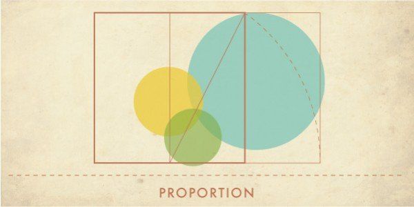
Proportion is the size relationship between elements in a composition. A large element signals importance; a small one recedes. When proportions are well-calibrated, viewers immediately understand what deserves attention without reading a word.
How proportion works in practice
- The Golden Ratio (1:1.618). Found in nautilus shells, Renaissance paintings, and Apple's logo construction. Used in typographic scale: if body text is 16px, a good heading size is ~26px (16 × 1.618).
- Type scale. A common web scale — 12px caption → 16px body → 20px h3 → 28px h2 → 40px h1 — creates proportion through consistent multipliers (Google's Material Design uses a 1.25 ratio).
- Image-to-text ratio. On editorial pages, a 60/40 text-to-image split tends to feel balanced; on landing pages a large hero image (70%+ viewport height) uses proportion to create immediate emotional impact before words are read.
Real-world example
The North Face logo places a bold condensed typeface next to a half-dome icon that is visually heavier. The proportional balance between the two is precise: neither crushes the other. Change either element's size by 20% and the logo loses its tension.
Application tip
Start with an 8-point grid system (every spacing and sizing value is a multiple of 8px). This constraints proportions automatically and produces consistent results across a team.
2. Contrast
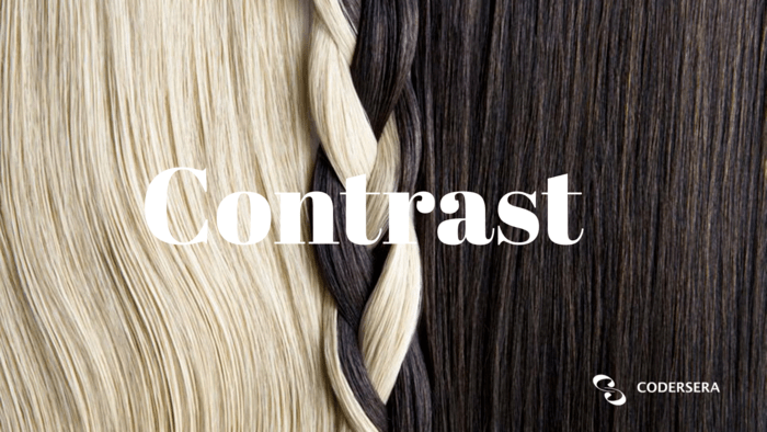
Contrast is the visible difference between two design elements — color, size, shape, texture, or weight. High contrast draws the eye; low contrast recedes. The human visual system is wired to notice difference, so contrast is the primary tool for directing attention.
The three dimensions of contrast
- Color contrast. Under WCAG 2.2 AA, normal text must achieve a contrast ratio of at least 4.5:1 against its background; large text (18pt / 24px, or 14pt / ~19px bold) needs 3:1. UI components like form borders and icons also need 3:1. Use WebAIM's Contrast Checker to verify before shipping.
- Size contrast. Pairing 14px body copy with a 48px headline creates contrast that communicates hierarchy without relying on color alone — critical for color-blind users.
- Weight contrast. Regular versus bold within the same typeface family is a low-effort, high-impact contrast tool — Google Docs uses it throughout its toolbar to distinguish active from inactive states.
Real-world example
Stripe's checkout form uses a white card on a gradient background, large bold amounts in near-black, and a vibrant indigo CTA button against the white surface. Each layer uses a distinct contrast pair. The result: users complete the form in the correct sequence without confusion about what to do next.
Common pitfall
Using color as the only differentiator (e.g., red = error, green = success). Approximately 1 in 12 men and 1 in 200 women have some form of color vision deficiency. Always pair color contrast with an icon, label, or texture change.
3. Hierarchy
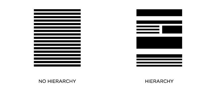
Visual hierarchy is the arrangement of elements so that importance is communicated by position, size, color, and weight — rather than by the viewer having to read everything to decide what matters. Good hierarchy makes the most important information impossible to miss.
Eye-tracking patterns that hierarchy must account for
Nielsen Norman Group's eyetracking research identified four dominant reading patterns for web pages:
- F-pattern: Two horizontal sweeps across the top, then a vertical scan down the left edge. Common on text-heavy pages without clear formatting.
- Layer-cake pattern: Eyes jump between horizontal bands (headings), skipping the paragraphs in between. Happens when users scan for section headings.
- Spotted pattern: Users jump directly to specific elements — a price, a button, a number — ignoring surrounding text.
- Commitment pattern: Full left-to-right reading; happens when users are motivated and content is formatted to reward careful reading.
Design hierarchy for layer-cake and spotted scanning, since those are the default for unmotivated first-time visitors. Reserve commitment-pattern design for documentation and long-form editorial.
HTML and hierarchy
Semantic HTML enforces hierarchy at the code level: one <h1> per page, <h2> for major sections, <h3> for sub-sections. Screen readers navigate by heading structure, so visual hierarchy and semantic hierarchy should always match.
Application tip
Apply the "squint test": blur your eyes and look at the layout. The most important element should still be obvious when fine detail is lost. If it isn't, the hierarchy needs more contrast or proportion work.
4. Emphasis
Emphasis is hierarchy at the element level — it's the single focal point that a viewer's eye is drawn to first. Every effective design has one dominant element; when multiple elements compete for dominance equally, the viewer gets confused and disengages.
Techniques for creating emphasis
- Color isolation. Make one element a vibrant accent color in an otherwise monochrome or muted palette. This is how most CTA buttons work — a bright orange or indigo button on a white page reads as "press this first."
- Size isolation. A hero image that occupies 80% of the viewport is the emphasis anchor; everything else is secondary.
- White space isolation. Surrounding a single element with generous empty space draws the eye as powerfully as color. Apple's product pages use this technique for the product itself.
- Position. Center-screen placement on a balanced layout creates inherent emphasis. Top-left placement leverages the natural reading start point in Western languages.
Real-world example
Duolingo's onboarding flow places a single large owl character with one action button below it. There are no competing elements. The entire screen exists to emphasize one choice. Conversion on these flows is consistently higher than multi-option layouts because there is no decision fatigue.
Common pitfall
Calling everything "important." If you have five bold red headlines on a page, none of them is emphasized — you've created visual noise. Emphasis requires contrast with the surrounding context; remove contrast and emphasis disappears.
5. Pattern (Repetition)
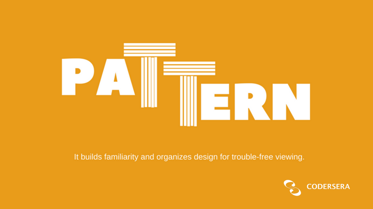
Pattern in design refers to the deliberate repetition of visual elements — colors, shapes, spacing, typefaces, icons — across a composition or a product. Repetition builds familiarity; familiarity builds trust; trust drives conversion.
Pattern at the brand scale
Consistent branding across all touchpoints increases revenue by up to 23% (Lucidpress / Marq Brand Consistency Report). The mechanism is trust: when every interaction uses the same visual vocabulary, users feel confident they're dealing with a coherent, reliable entity.
- Design tokens. Modern design systems encode pattern as tokens:
color-primary-500,spacing-md,font-heading. In Figma, these map to variables; in code, they become CSS custom properties. Tokens are how pattern stays consistent at scale. - Component libraries. Repeating the same button, card, or form element across a product is pattern in UI. Airbnb's DLS, IBM's Carbon, and Google's Material Design 3 all demonstrate this at enterprise scale.
Pattern vs. monotony
Repetition without variation becomes boring. The solution is variety within pattern: repeat the structure (grid, spacing, color family) but vary the content (different images, different heading text, alternating section layouts). This is why editorial websites use the same column grid for every article but vary the hero image and section order.
Application tip
Define your pattern before you start designing: choose 2 typefaces (one for headings, one for body), a palette of 5–7 colors with assigned roles (primary, secondary, accent, background, text, error, success), and a single spacing scale. Every design decision after that either reinforces or breaks the pattern.
6. Balance
Balance is the distribution of visual weight in a composition so that no single area feels heavier than another — unless hierarchy demands it. An unbalanced layout creates subconscious discomfort, like sitting in a chair with one leg shorter than the rest.
Three types of balance
Symmetrical balance
Elements are mirrored on either side of a central axis. Feels stable, formal, and trustworthy. Used heavily in banking, healthcare, and government websites where authority and reliability are the brand values. The trade-off: it can feel static.
Asymmetrical balance
Elements of different sizes, weights, and positions create equilibrium through careful arrangement. A large light-colored element can balance a small dark element; a cluster of small items can balance a single large one. Asymmetric layouts feel dynamic and modern. Most contemporary SaaS product marketing sites (Linear, Vercel, Notion) use asymmetric balance.
Radial balance
Elements radiate from a central point, like spokes on a wheel. Used in logos, icons, and specific infographic layouts. Instagram's gradient logo (2016–present) uses radial composition.
Balance and the responsive challenge
A desktop layout balanced on a 1440px canvas will likely be unbalanced at 375px mobile width because columns collapse to a single stack. Design balance must be tested and adjusted at every major breakpoint — not treated as a desktop-only concern.
7. White Space (Negative Space)
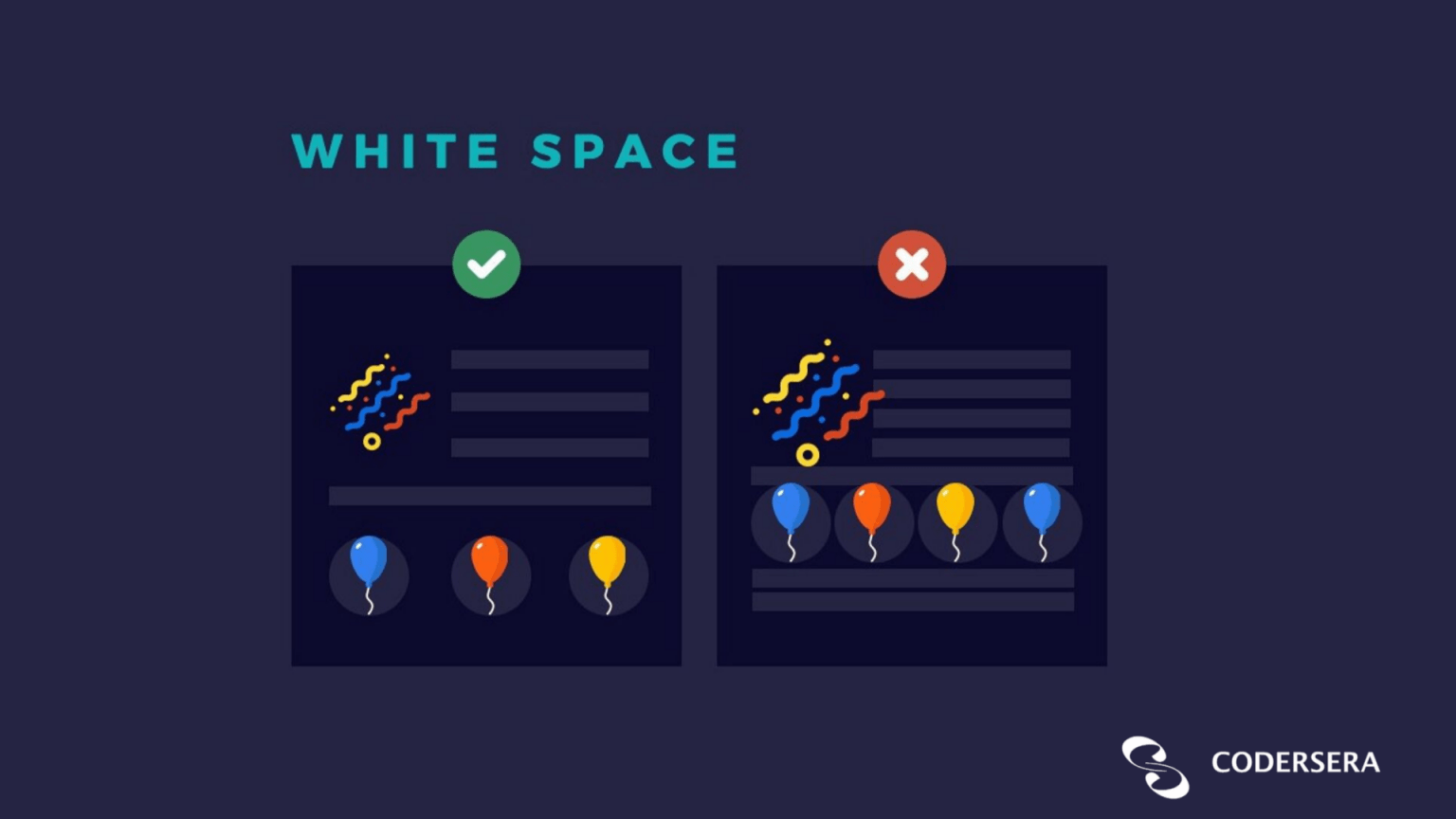
White space — also called negative space — is the empty area between, around, and within design elements. It is not "wasted space"; it is an active design tool. White space creates breathing room, improves readability, signals premium positioning, and reinforces hierarchy.
Macro and micro white space
- Macro white space: the large empty areas between major page sections or around the overall composition. Apple's product pages are famous for this — a product floats in a sea of white that communicates confidence and focus.
- Micro white space: line-height (leading), letter-spacing (tracking), and padding inside components. WCAG 2.2 recommends line height of at least 1.5× the font size and paragraph spacing at least 2× the font size for readability.
White space and brand perception
Studies of product pages consistently show that adding white space increases perceived product value. Luxury brands (Hermès, Rolex) use extreme white space to signal exclusivity. Discounters (Amazon, Wish) pack content tightly to signal deal density. Your white space choices are a brand statement.
White space in data-dense interfaces
Dashboard and table UIs need white space most but get it least. A simple rule: add 16px of vertical padding inside every table row, 8px horizontal. Headings should have at least 24px of top margin from the previous element. These numbers are the difference between data that feels manageable and data that overwhelms.
How the 7 Principles Work Together
No principle operates in isolation. A well-designed web page typically uses all seven simultaneously:
- Proportion sets the size hierarchy of elements
- Contrast makes the hierarchy visible
- Hierarchy sequences where the eye travels
- Emphasis creates the single most important focal point
- Pattern repeats the vocabulary across the whole composition
- Balance distributes the weight so the layout feels stable
- White space gives every element room to be perceived individually
The most common failure mode is over-emphasis — trying to use all seven principles at maximum intensity simultaneously. Strong design usually means deliberately restraining five or six principles so one can dominate.
The 7 Principles and Accessibility (WCAG 2.2)
Three of the seven principles map directly to legal accessibility requirements under WCAG 2.2 and the ADA:
| Principle | WCAG 2.2 Requirement | Success Criterion |
|---|---|---|
| Contrast | 4.5:1 for normal text; 3:1 for large text and UI components | 1.4.3, 1.4.11 |
| Hierarchy | Logical heading structure; focus order matches reading order | 1.3.2, 2.4.3 |
| White space / Proportion | Touch targets minimum 24×24 CSS pixels (WCAG 2.2 new) | 2.5.8 |
Ignoring these requirements is not just a design problem — it is a legal liability. The European Accessibility Act requires WCAG 2.2 AA compliance for digital products sold in the EU by June 2025. The US DOJ finalized its WCAG 2.1 rule for state/local government websites in March 2024. Private sector compliance litigation continues to rise year-over-year.
Applying the Principles: A Decision Framework
When you start a new design project, work through this sequence:
- Define the hierarchy. What are the three things you want users to see, in what order? Write this down before opening a design tool.
- Establish proportion. Translate the hierarchy into size decisions — assign relative sizes to each tier of the hierarchy.
- Set the pattern. Choose your typefaces, colors, spacing scale, and component vocabulary. Commit to them before designing individual screens.
- Apply contrast. For each element pair, verify you have sufficient contrast — color, size, or weight — to communicate the difference. Run a WCAG contrast check at this stage.
- Add emphasis. Identify the single most important CTA or message per screen. Amplify it with one additional contrast mechanism (color, isolation, size).
- Check balance. Step back and evaluate visual weight. Is anything pulling too hard in one direction?
- Audit white space. Add 20% more white space than feels comfortable. Most designers add too little; more is almost always better.
Performance and Modern Design Tools in 2026
Understanding principles matters more, not less, in an AI-assisted design environment:
- Figma AI (shipped progressively through 2025–2026) can suggest layouts, auto-generate component variants, and flag low-contrast text. It makes execution faster but does not decide which principle should dominate on a given screen.
- Adobe Firefly (integrated into Illustrator and Photoshop as of 2024–2025) generates images and vectors from text prompts. The generated assets still need to be composed using the seven principles.
- Framer and Webflow allow designers to implement responsive, animated layouts without hand-off to developers. The output quality still depends entirely on the designer's understanding of proportion, balance, and hierarchy.
If you're building a team that produces design-to-code work — whether in-house or remote — it pays to ensure your developers also understand these principles. A frontend developer who can look at a design and reason about why the hierarchy is broken saves significant back-and-forth. Codersera's vetted remote React developers include engineers with strong UI fundamentals, useful for teams where design and implementation overlap.
Common Pitfalls and Troubleshooting
| Symptom | Root Cause | Fix |
|---|---|---|
| "The layout feels busy" | Too many elements competing at equal weight | Reduce to one emphasis point per section; increase white space |
| "It looks generic" | No defined pattern; inconsistent typefaces, colors | Define a design system with tokens before designing screens |
| "Users don't know what to do" | Weak hierarchy and emphasis on CTAs | Make one button more prominent; remove or de-emphasize secondary actions |
| "It fails accessibility audit" | Contrast ratios below 4.5:1; touch targets below 24px | Run WebAIM contrast checker; increase padding on interactive elements |
| "Looks good on desktop, broken on mobile" | Balance designed only for wide viewport | Design balance at 375px first; add complexity for larger breakpoints |
| "The logo feels wrong at small sizes" | Proportion breakdown at small scale | Create a simplified logo variant (monogram or icon-only) for favicon and mobile |
Web Design Types That Use These Principles
These seven principles apply across every web design style, but they manifest differently in each:
Flat Design
Heavy reliance on color contrast (no shadows to create depth), strong typographic hierarchy, and generous white space. Popularized by Microsoft's Metro design language (2012) and still dominant in modern SaaS product UI. Figma's own UI is flat design.
Minimalist Design
Proportion and white space pushed to extremes. Often only 2–3 colors, 1–2 typefaces, and every element that doesn't serve function is removed. Apple.com product pages are the benchmark.
Typography-First Design
Hierarchy and proportion expressed entirely through type. A single typeface at multiple weights and sizes can carry an entire layout. Publications like The New York Times and Bloomberg use this approach.
Illustrative / Character-Driven Design
Emphasis created through illustrated characters or scenes. Balance must be carefully managed because illustrations carry irregular visual weight. Duolingo, Mailchimp, and Intercom use this effectively — their illustrations are always balanced by structured text and generous white space on the opposite side.
For a deeper look at how these design types apply to building web products, see the Codersera post on the role of emotions in UX design, which covers how visual design decisions influence user trust and engagement.
FAQ
Are there 7 principles or more? Some sources list 12 or 13.
The seven listed here (proportion, contrast, hierarchy, emphasis, pattern, balance, white space) are the most commonly cited core set in graphic and web design education. Expanded lists (12–13 principles) typically add rhythm, movement, unity, variety, proximity, and alignment as separate entries. These aren't wrong — they're refinements. If you understand the core seven well, the additional principles will feel intuitive when you encounter them.
Do the same principles apply to logo design, web design, and print?
Yes. The principles are medium-agnostic — they describe how human vision processes composition. A logo, a poster, a web page, and a mobile screen all benefit from the same hierarchy, contrast, and proportion thinking. What changes is the constraints: logos must work at 16px (favicon) and 200px (letterhead); web layouts must work at 375px and 1440px.
What's the minimum contrast ratio I need to pass WCAG 2.2 AA?
4.5:1 for normal-sized text (below 18pt / 24px). 3:1 for large text (18pt / 24px and above, or 14pt / ~19px bold). 3:1 for user interface components like form borders and icons. Use the WebAIM Contrast Checker to verify. These thresholds have not changed from WCAG 2.1 AA.
How do I balance a mobile layout when I can only use one column?
Balance on a single-column mobile layout is achieved through vertical rhythm (consistent spacing between sections), typography scale (proportional heading sizes), and image sizing (full-width images maintain balance naturally). The squint test still works: blur your eyes, and the layout should feel evenly distributed from top to bottom without any section feeling dramatically heavier than the others.
Do I need all 7 principles in every design?
Not at maximum intensity simultaneously. All seven are always present in some form — you can't have a design without balance, or without some form of contrast. But you choose how prominently each one features. Minimalist designs dial down pattern and emphasis in favor of proportion and white space. Promotional materials dial up contrast and emphasis. The choice of which principles to foreground is itself a design decision.
What tools help me apply these principles in 2026?
Figma (with AI layout suggestions and variable-based design tokens) for screen design. Adobe Illustrator + Firefly for graphic/print design. Framer or Webflow for design-to-code. For accessibility verification: WebAIM Contrast Checker, Figma's built-in accessibility annotations plugin, axe DevTools browser extension for live pages.
How do Gestalt principles relate to the 7 principles of design?
Gestalt psychology describes how human perception groups and interprets visual elements (proximity, similarity, closure, continuity, figure/ground). The 7 design principles are largely practical applications of Gestalt theory: hierarchy leverages figure/ground, pattern uses similarity, white space uses proximity and closure. Understanding Gestalt gives you the "why" behind the principles; the principles give you the actionable rules.
What's the most important principle for a beginner to master first?
Contrast and hierarchy together. They are the principles most responsible for whether a design communicates its message effectively. Without sufficient contrast, nothing stands out. Without hierarchy, users don't know where to start. Get those two right and the other five will follow more naturally.
References and Further Reading
- Web Content Accessibility Guidelines (WCAG) 2.2 — W3C Recommendation
- What's New in WCAG 2.2 — W3C WAI
- Text Scanning Patterns: Eyetracking Evidence — Nielsen Norman Group
- 13 Graphic Design Principles — Figma Resource Library
- Contrast and Color Accessibility — WebAIM
- 13 Principles of Design: A Visual Guide — Superside
- ADA Web Accessibility Rule Fact Sheet — ADA.gov, March 2024
- Gestalt Principles — Interaction Design Foundation